Wednesday, October 19, 2011

Operational Data Analytics using Analyzer

I'm reading: Operational Data Analytics using AnalyzerTweet this !
Any quantitative data analysis would mean that there are a huge number of data points to analyze using visualizations and derive meaningful readings from this sea of data. A major part of the reporting world is composed of analysis of operational data, compared to analytical data. Reporting and analytics solutions are not meant just for the most elite management audience, instead operational reporting and analytics is one of the biggest areas where analytics can help to improve business processes. At this level of data analysis, generally the reporting constituency is formed of very simple visualizations for data representation, for example simple charts and graphs, grids, etc., and the target audience cannot be expected to be skilled enough to use advanced visualizations using sophisticated statistical formulas for their derivation. But that does not mean that there is no need for any advanced reporting solution in this area, as the reporting requirements are pretty basic.

In this Analyzer Recipe we will take a look at how an intelligent reporting solution can bring that difference to operational data analytics with simple though effective sophistication. For the purpose of discussion, we will take as an example Line Chart Analysis. Line Charts typically draw a graph connecting a series of continuous data points. In the below screenshot, you can see a simple report I have created using a simple line graph and pivot grid. The chart contains a reasonable number of data points for reseller sales amount. The same data is also represented in the grid for a detailed view. The immediate question that should come to the mind of regular users of such reports is, what more can be improved in such reports? We will look at that now.
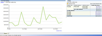


Many would not know that a more sophisticated form of line chart is the spline chart. Say your capture systems have acquired limited and non-continuous operational data, and you intend to create an intelligent trend out of your limited data. The spline chart is an intelligent option that would fit a curve through your data. With just a simple change in the graph type, the report would look like the below screenshot. If you compare the graphs in the above and below screenshots, you would find that the increase and decrease in the data is shown much more minutely in the spline graph compared to the line graph. You can use the grid to confirm this. For a better experience, try both graphs with non-continuous data, and in that case line graph would not give you a continuous curve, whereas the spline would provide a smooth graph out of your non-continuous data.


Analyzer charts provide interesting and advanced options for line charts (as one example of many chart types available) as shown in the below screenshot. So users who excel in sophisticated operational data analysis, can bring in the required scientific analysis using the below options, without the need to migrate from their regular graphs that might be used by a broad category of operational data analysts. In this way the more basic needs of the general user are taken care of, while at the same time enabling the “power users” to do their own advanced analysis and reporting, using the very same tool.
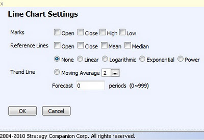


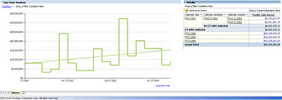
By changing the chart type to Step Line Chart, which is a more sophisticated form of a line chart, and including a trend line for linear moving average using the options shown in the above screenshot, an interesting trend can be created out of the operational data which is not that clearly visible in the above two types of line charts. With the moving average reference, analysts can always see whether the trend is constant compared to the moving average, which would not be that clear in the absence of this reference line.


In my views, the real power of a reporting solution lies in the ease and effectiveness with which it can make that data visible to the users that is not instantly visible to the human eye. Also, when users do not need to train themselves (or worse yet, go to a training class) to use sophisticated visualizations, and they can continue with their regular tools of the trade which provide an acceptable level of “polishing”, users will be able to adopt and use the reports and reporting solution with the impression that it’s their regular analysis tool with a flavor of modernization in it.

We saw how a line chart can be easily converted to a spline chart for analysis of limited data and better curve fitting purposes, and how this can be converted to a step line chart for better trend analysis with advanced scientific options. Analyzer has many more other such chart types and options, and you can visit the Analyzer web site to explore them more.

Monday, October 17, 2011

Excel Services data source in Performancepoint Services 2010, Hadoop Data Source : New breed of data sources

I'm reading: Excel Services data source in Performancepoint Services 2010, Hadoop Data Source : New breed of data sourcesTweet this !
Data is the only currency that is generated every second in IT business and its the only currency that every business was to gather and utilize in the best possible way. BIG data and Unstructured data are creating tsunami sized data related challenges for storage, processing, as well as analysis. In the world of structured as well as unstructured data, more and more newer breeds of data sources are evolving and its good to keep a tab on these evolving breed of data sources.

We earlier heard the announcement related to connectors for Hadoop environments. In the new announcement made recently, Microsoft is now propagating Hadoop in its on-premise and cloud based platform with full integration with its regular line of products ranging from Excel to Business Intelligence stack. Hadoop, Hive, Pig etc are the new terms you would hear now in microsoft parlance too, and with this comes the new breed of data sources. You can read more about this announcement from here.

Even in the world of structured data, if you have a tab on the advancements happening in the Microsoft BI world, you would find newer category of data sources. One such example is Excel Services Data Source in Performancepoint Services 2010. Here's a tutorial on the same on Performancepoint Services Team blog. One service application acts as a data source for another service application, it is a very interesting concept in itself and opens up a new range of possibilities.

With SQL Server Denali, even SSRS would be deployed as a service application when you install it in sharepoint integrated mode. So by the integration theory we just discussed between two service applications, there is also a possibility in the future that PPS scorecards can be used as a data source for SSRS Reports, which has always been the other way round till date. With more variety of data sources, the newer challenge on the horizon is selecting the best way to source data as virtually anything can become source of data !

Tuesday, October 11, 2011

SQL Azure Federation Architecture Solution

I'm reading: SQL Azure Federation Architecture SolutionTweet this !
Federations is one of the most effective aspect of any architecture design, which basically provides de-centralization of operations, effectively providing parallelism, scalability, de-coupling and multi-tenancy. Cloud has become a dominant platform for any kind of architectures, and federations on the cloud for multi-tenant solutions are even more interesting and challenging. In Microsoft parlance, this would translate to SQL Azure Federations. A lot of reference material is already available on the same, so I would not go into explaining the same again. Below are some very useful links that answers some very important questions like:

1)
What are Federations ?
2)
What is Federation Architecture ?
3)
What kind of solutions can use Federation Architecture ?
4)
How to scale an application with SQL Azure Federations ?
5)
Sample application using SQL Azure Federations for multi-tenant solution
6)
Data Migration on SQL Azure Federation

Thursday, October 06, 2011

Tribute to Sir Steve Jobs

I'm reading: Tribute to Sir Steve JobsTweet this !
Edward Tufte and Stephen Few are two of the most famous names in the field of Information Visualization Design. But in my views Apple has done wonderful work in this field, and Sir Steve Jobs contribution in the field has been immense and which cannot be explained in words. Sir Steve Jobs needs no introduction, and this post is a humble tribute to him.


Monday, October 03, 2011

Powerpivot and BISM in SQL Server Denali

I'm reading: Powerpivot and BISM in SQL Server DenaliTweet this !
Business Intelligence Semantic Model (BISM) is the new philosophy in MS BI analytics parlance, that is taking shape in SQL Server Denali. Tabular projects and MOLAP with choice of MDX or DAX can be termed as a brief definition of BISM, in tangible terms. SQL Server Denali CTP3 ships with all the new features supporting and reflecting BISM in SSAS. But that is just one part of the world.

Powerpivot is the flagship product of microsoft for self-service business intelligence. And surprisingly, microsoft is aggressively inducing the flavor of BISM here also. Three major additions to powerpivot are:

1) Diagram View: To me this looks more like a DSV equivalent of SSAS. Though I have not tried hands on, but from what it sounds, this is a very valued addition to the tool. End users would enjoy modeling using a designer, compared to an excel kind of UI for developing models.

2) Hierarchies: The ability to create user-defined hierarchies would mean that user can logically arrange and relate entities, which can translate the user can easily envision and model drill-down and rollups on their data. Hierarchies are so essential part of any data model, and this capability would enable users to logically analyze their data.

3) Perspectives: This is not a new feature, and those who have used SSAS would definitely understand what this means. If powerpivot data models are shared on a collaboration platform like Sharepoint, this feature can be a real value addition and abstract relevant part of the models to relevant users.

There is much more than just the above listed features, that is being offered in Powerpivot for Excel with SQL Server Denali. To learn about the same, check out this link.
Related Posts with Thumbnails